A tourism app for exploring Spain, one destination at a time.
Paginar defined the experience and interface system for the mobile app of SEGITTUR’s Smart Destination Platform, part of Spain’s Ministry of Industry and Tourism.
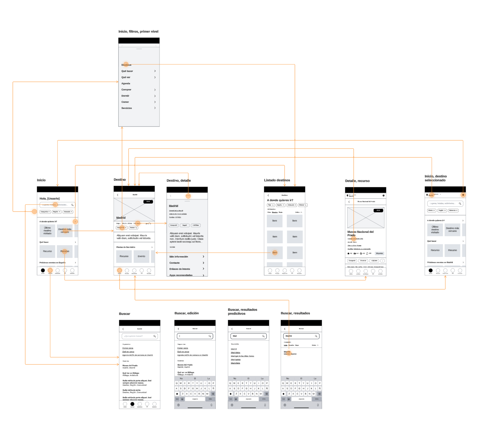
Information Architecture
User flows for the PID tourism app connect exploration of each destination with search, content, reservations, and the personal area of a multi-destination experience.
SEGITTUR needed a tourism app that could bring together information and services from different destinations in a clear experience. As Telefónica España’s partner, we organised the architecture, flows and interface templates, and defined a design system and prototype to support continuity into development.
Services
We investigate people’s needs, motivations and behaviours alongside the business context. We combine qualitative and quantitative methods to identify opportunities and inform design decisions with evidence.
We organise a digital product’s information, navigation and flows so people can understand it and achieve their goals. We make tasks clear, straightforward and appropriate to their context of use.
We shape interfaces through hierarchy, typography, colour and components. We design screens and interaction states that reflect the brand’s identity, with attention to readability and accessibility.
We organise visual foundations, components and interaction patterns into a shared system. We document how to use them so design and development teams can build and evolve consistent interfaces.
We create interactive representations of a product to explore and evaluate how it works before development. Prototypes help test ideas and user journeys and build a shared understanding across teams.
Work process
Spain is one of the world’s leading tourism destinations. In 2025, it welcomed 96.8 million international tourists, the highest figure in its historical series. That scale comes with an exceptionally diverse offering of cities, regions, cultural attractions, nature, activities, and services, and millions of travel decisions made before and during a visit.
The Smart Destination Platform (PID) addresses this reality as public digital infrastructure for tourism. Its approach connects with that of smart cities: helping digital services and local stakeholders—destination managers, businesses, residents, and visitors—work together more effectively. In tourism, that vision enables destinations to build experiences that are more connected, contextual, and able to evolve.
The new PID tourism app was conceived to help domestic and international visitors discover what to do, what to see, and how to organize their time in each destination. The ambition was to design a tool for the visit itself, complementing inspiration channels and taking users from discovery to a reservation or purchase when relevant. Working with Telefónica España, Paginar provided comprehensive UX consulting and interface design, from information architecture and wireframes to visual design, templates, a design system, and a high-fidelity prototype.
The main challenge was to design a multi-destination app that could serve both a shared platform and the distinct reality of each region. Each destination has its own offering, identity, scale, and priorities. The experience could not simply gather content in one container or require destinations to lose their context.
We defined an architecture that combines shared language and patterns with the ability to present information specific to each destination. The home screen, listings, map, search, detail pages, and personal area form a common system, while content, routes, services, and actions adapt to each location. We also considered assistance, weather, and the transition to reservations or purchases. This lets people move between different destinations using the same logic, without turning their visit into a generic experience.
The process combined stakeholder interviews, reference analysis, and a review of product requirements. This stage aligned service needs with the expectations of a broad tourism audience and established the principles that would guide the experience: clarity, approachability, up-to-date information, and trust.
On that foundation, we defined the flows connecting discovery, search, content, and actions associated with the visit. The goal was for every screen to help people move forward without first having to understand the platform’s internal structure.
With the structure defined, we translated the experience into wireframes for the priority screens and flows. This material enabled us to validate content hierarchy, navigation, and decision points before finalizing the visual design.
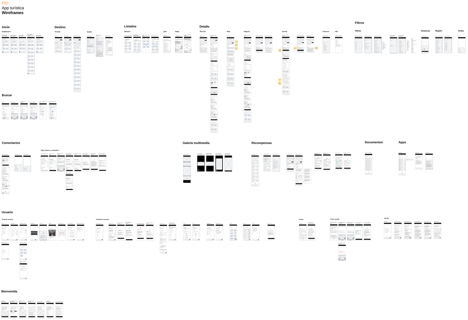
Wireframes
Mobile-first wireframes used to define screen structure, content hierarchy, and navigation flows before visual design.
The design system was the starting point for turning experience decisions into a shared, reusable foundation. We defined color, typography, spacing, and iconography, then developed components and patterns that let teams build new screens using the same logic.
The visual direction gave the app its own expression while retaining the flexibility to represent the identity and richness of multiple destinations. Drawing on stakeholder interviews and reference analysis, we built a simple, approachable, modern, and trustworthy interface for a broad tourism audience.
This shared identity did not mean a neutral interface. We designed a visual language with its own character, in which typography, color, images of recognizable places, and graphic elements establish content hierarchy and help each destination express its personality within a common system. Accessibility was integrated from the outset through contrast, readability, and understandable interactive states in both light and dark modes.
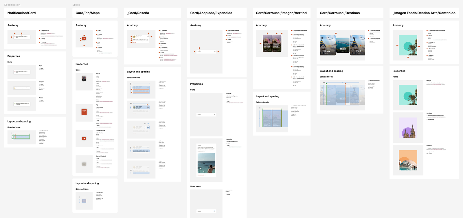
Design System
A Figma design system with foundations, reusable components, and patterns to maintain consistency, support collaboration, and accelerate the app’s evolution.
Using that shared language, we designed templates for the main usage scenarios: content, routes, maps, search, filters, and contextual actions. Each template combines information, imagery, and actions so people can quickly understand what is relevant and what they can do next.
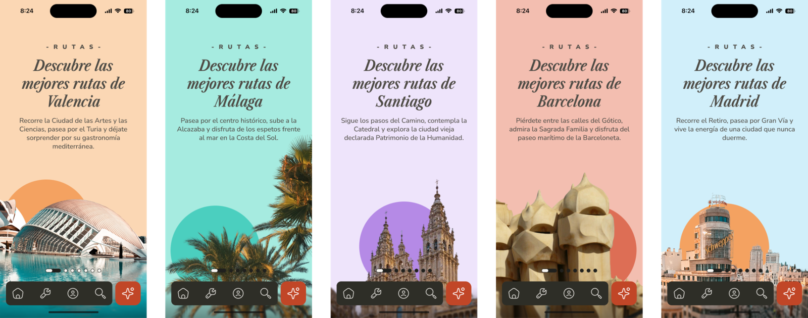
UI Templates
Interface templates for the app’s main scenarios, designed to organize tourism content, maps, routes, search, and actions clearly and consistently.
The result
Finally, we connected the screens and components in a high-fidelity interactive prototype. The prototype made the main flows visible and let people explore the experience as a user would, from discovery and search to details and actions associated with the visit.
The project provided a complete vision of the experience for Spain’s new tourism app: an architecture for moving between destinations, a mobile interface centered on the visit, and a design system that makes that vision sustainable. For SEGITTUR and Telefónica España, it provided a tangible product foundation for advancing the Smart Destination Platform app.
- Client

- Partner
